Why your church needs a mobile-friendly website
“If you build it, they will come.” Conversely, if you don’t build it, or if you don’t build it well, they will leave. That’s essentially the gist of a survey conducted by Google, and summarized at Mobile Ads Blog. This study showed that 67% of people browsing a “mobile-friendly” website said they’re more likely to buy (or more broadly, consume) what the site was offering, while 61% of people encountering a mobile-unfriendly site quickly move on.
If you’re simply wondering WHAT a mobile website is, read this breakdown of mobile websites and mobile apps; and if you’re wondering WHY you need either, here’s seven compelling reasons.
As for what’s a mobile-friendly site, the results from the aforementioned Google survey make it clear. These Three Features of a Mobile-Friendly Website are targeted to commercial websites (we’ve translated them for the church website):
[divider]
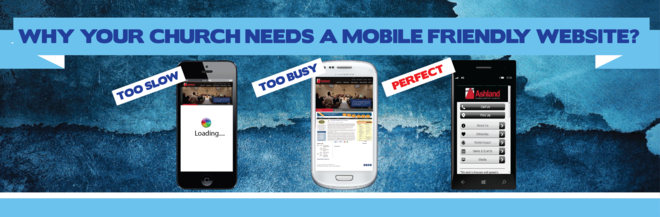
1. Fast loading.
[divider]

If your mobile website takes more than 5 seconds to load, your mobile visitor would have already moved on. When thinking about website speed, consider the following:
- The user’s device. Is it a basic phone with web access; a smartphone; or a tablet?
 Are they connected via WiFi or through a cellular network?
- What browser are they using, and is your site optimized for it? Popular browsers include Microsoft’s Internet Explorer, Google’s Chrome, Apple’s Safari, and Mozilla’s Firefox.
[divider]
2. Mobile-friendly features.
[divider]
 Don’t make your visitor feel like he or she has unusually fat fingers. Key mobile-friendly features include:
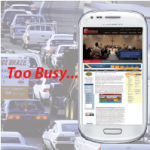
- A small number of large, simple icons. If your website visitor has the choice between 10 text links and another 5 graphic links, and yet another 3 video links, they’ll be overwhelmed. Not to mention…and may not even stick around to see it, since such a page will likely take a long time to load.
- A small number of large, simple text links. Conversely, people don’t mind a text-rich, graphics-poor mobile website, as long as it loads fast, is clear, and it doesn’t contain broken (nonworking) links. They didn’t come to your site to be entertained by its beauty.
[divider]
3. Quick access to business information.
[divider]
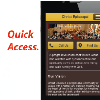
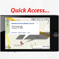 Don’t confuse the visitor with secondary or unnecessary services and products. Show them what they want and need from your ministry. As far as possible, the following items should be up front:
- Directions, or to a mobile map
- Contact Information; a click-to-call or SMS button makes it even easier
- Link to your giving/donation portal
- A featured resource–A sermon audio/video archive or an online store selling church-branded gear
- A featured event–An evangelistic series that is right around the corner shouldn’t be hiding behind multiple clicks
Why weary the patience of your virtual visitors with a mobile website that’s slow, unattractive, and confusing? Treat them as consumers, and they’ll reward you by hanging around and partaking in your services. For help with optimizing your mobile site, considering taking advantage of Symbiota’s experience building them for other churches.
About the author
Jason Alexis
Jason Alexis is passionate about helping churches, ministries and non-profits get their message out to a mobile, global and social generation. Having began his career as an engineer, Jason believes that marketing and communications should be based on hard data, systemic analysis and proven best practices. As the founder of Fluid Ministries, Jason brings this scientific common sense approach to church communications and marketing. He helps churches to spread the age-old Gospel message through modern high-tech communication channels including mobile apps, text messaging and social media. As a devout Christian, Jason bases his life on solid Biblical principles. That said, Jason recognizes his own imperfections and failure to consistently live out his convictions. Because of this, he knows his need for God's mercy and compassion. He is inclined to extend this mercy to others rather than judge them. Jason strives to run his business and personal affairs with integrity and virtue.


Comments